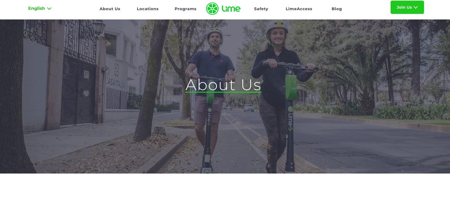
My third post dives into the importance of user testing and showcases the testing that I conducted on the Lime website.
A quick overview of Lime is it's a company that looks to offer transportation options (mobility) to all communities.
I used the following test script for my usability test:
- The Home Page Tour – I showed the participant the home page and asked them to say aloud the following: what strikes you about it, whose site you think it is, what can you do here, what it’s for?
- Question 1 – Let’s assume that you are interested in learning more about Lime, can you find out if Lime is available in your area?
- Question 2 – Now that you’ve seen Lime is available in Seattle, are you able to find the rider options available in Seattle?
- Question 3 – Are you able to locate any information on how to get a safety helmet since its proper rider safety to always wear a helmet and Seattle law that all bicycle and scooter riders wear a helmet?
- Question 4 – Are you able to find the download button for your preferred mobile device?
I view it as important that visitors can and should expect their websites to include a clear, easy to understand description of their product, how to use their product or service, and clear explanation of the features for their offered product. This needs to be done strategically to eliminate the requirement of the visitor to search on their own.
The purpose of my test was to see if three participants could easily work through four test prompts that I myself encountered when first browsing the website.
User Testing
I performed a usability test specifically the “First Click Testing” by allowing the participant to use my personal MacBook with a screen recorder and microphone to record the test while walking each person separately through the test script shown above stating when they could click links on the site or simply just scroll up/down the home page. I used three participants for this test; two female and one male, all three Caucasian, ages ranging from 25 to 60.
I will summarize the results using qualitative data as I took minimal notes to observe when the participant became frustrated and would speak aloud when they were becoming impatient.
Summary of Results
The Home Page
- All three participants had heard of Lime since they’ve seen the green scooters and/or bikes in the area and knew they were for rental purposes.
- One participant assumed the website was more of a gateway to download the app that would provide the visitor with more information.

Question 1
- All three participants were able to correctly verify that Seattle was a location with Lime available.
Question 2
- None of the participants were able to verify which rider options they could use in Seattle.
Question 3
- All three participants were unable to find information on obtaining safety/rider helmets however one did say they would use their own.
Question 4
- All three participants said they would use the App Store to download the app and two of the participants were able to locate the download buttons on the site after.
Top three usability problems
- No way to search the website
- Too much functionality that requires user registration
- Concept is Unclear
Looking back on the three different test subjects, I would change the order of the questions and move the last question ato the front as I noticed people would become lost after searching for answers to my questions and forget to go back to the home page. I would also look to create a word by word script to stick to as I realized my wording wasn’t the same for each task when reading to a different participant.
Suggestions for Improvement
- Add Google’s search plug in to the Lime web domain index.html file to create a search option
- Add relevant information to the locations page so entice visitors that Lime is a good option where they live or worth Voting to bring Lime to their city
- Provide a mission statement for Lime so visitors know exactly what Lime is and the purpose for the company